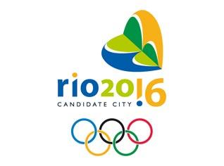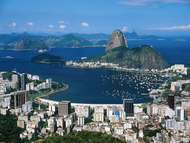
On October 2, 2009, Rio De Janeiro was awarded the right to hold the 2016 Summer Olympic games. The logo for the games shown alongside is in the shape of a Sugar Loaf. According to the winning designer, Ann Soter,"The Sugar Loaf in the shape of a heart represents the Brazilians' indisputable passion and vibration for sports. The exclamation point replacing the numeral 1 in the writing 'Rio 20!6' symbolizes Brazil's heightened expectations with the chance of hosting the event". The distinctive shape of the Sugar Loaf is representative of the city's natural assets "cariocas" take so much pride in. The proposed logo is intended to depict the varied colors of Rio's exuberant nature. You can see from the picture of Rio below how the logo ties in with the landscape. The colors Yellow, Green and Blue are also the colors of the Brazilian flag. The logo was chosen from among 4 finalists. The logo was unveiled Monday, Dec. 17, during the Brazil Olympic Award ceremony, held at Rio's Teatro Municipal. |

 | The original logo release by the Braziian Olympic Committee was a plain Green logo. |
Sources:
http://www.praha2016.org/olymp/jnp/en/news/Applicant_Logo_Modified.html


0 yorum:
Post a Comment