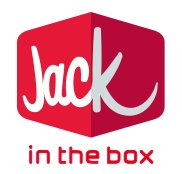
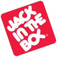
 Jack in the Box 2009 Logo |  Jack in the Box Old Logo |
Jack in the Box competes primarily with other major national fast-food chains such as McDonald's, Taco Bell, Kentucky Fried Chicken and Wendy's. Food items include the Jumbo Jack, Potato Wedges, and Ultimate Cheeseburger.
In March 2009, Jack in the Box unveiled a new corporate logo shown above alongside the old logo. The new logo is significantly different from the old logo with the following most visible change
1. The new logo is 3-dimensional and the Box clearly stands out.
2. The font is more contemporary and pleasing to the eye.
3. The focus is more on "Jack" than "in the box", and I am wondering if thats to promote the use of Jacks more than Jack in the Box.
4. Some people say that the long curve in the letter 'K' appears to be a smile (just like the Amazon logo).
They still continue to maintain the bright red, although it appears to be a bit toned down.
Overall, I like the new logo as it does give it a modern feel although some bloggers feel that the logo may not be apt for restaurant logo. What do you think? Submit your comments below.
The logo was created by Duffy & Partners.
Trivia Question - What other brands use yellow as a primary brand color?
Sprint, DHL, Stanley, DeWalt, Lance Armstrong’s Live Strong and McDonald’s
Source : http://www.jackinthebox.com/corporate/press-room/press-releases/press-release.php?id=263
http://en.wikipedia.org/wiki/Jack_in_the_Box


0 yorum:
Post a Comment