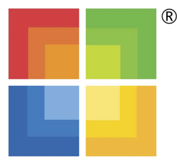

| In a bid to compete with the Apple Store, Microsoft had announced the launch of the Microsoft retail store in the early part of 2009. Microsoft hired a veteran WalMart executive to help start this new initiative. Details of the store are quite sketchy and the first view for buyers would be in the Fall when Microsoft plans to open two stores, one in Scottsdale, Arizona and Viejo, California. In preparation for the launch of the store, Microsoft unveiled their MS Store logo in August, 2009. The logo is quite simple and is a square version of their Windows flag. The 4 colors, Red, Green, Yellow and Blue are in the same position as the Windows logo (See below). The individual squares have a gradient, which gives it a slightly different look. I am not sure what the point is but if you stare at the logo long enough, you are likely to get hypnotized. Maybe that the point. I am not sure what the stores will look like but given the colorful logo, I am assuming it will be in sharp contrast to the plain white Apple stores which is so simple in their design. We will find out shortly. |
| The MS Windows logo which has been around for ages is shown here to understand the "inspiration" behind the MS Store logo. |


0 yorum:
Post a Comment