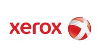
| Xerox Corporation unveiled their new logo in January 2007. The new logo is the biggest change in its corporate history and reflects a transformation of the company from a document management company to a customer-centric company built on a continuing history of innovative ideas, products and services that meet the needs of businesses small to large.
The new Xerox logo is now a lowercase treatment of the Xerox name - in a vibrant red - alongside a sphere-shaped symbol sketched with lines that link to form an illustrative "X," representing Xerox's connections to its customers, partners, industry and innovation, and designed to be more effectively animated for use in multi-media platforms. Xerox settled on lowercase letters because they seemed friendlier, and on a deeper red and a thicker font, to stand out better on the Web and on high-definition television. |
 | The original logo emphasizes the "Document Compamy" focus that was original focus of the company, which manufactured and sold a range of color and black-and-white printers, multifunction systems, photo copiers, digital production printing presses, and related consulting services and supplies. |
Some early reviewers feel that the logo looks like a Beach Ball or candy.


0 yorum:
Post a Comment